THE BRIEF
Greens had built a strong and familiar presence in Malta, supported by decades of customer trust and a well-established supermarket offer. A rebrand, however, was not initially on the agenda.
Through our work with the business, Steves&Co. identified an opportunity to strengthen and modernise the brand. While the existing identity remained recognisable, it had been applied in different ways over time and lacked the flexibility needed to support a broader retail portfolio.
The turning point came when the Greens board decided to turn to Steves&Co. when expanding into smaller, convenience-led formats. We recognised that introducing a new offer under the existing system risked creating a fragmented family of brands. It was the right moment to look beyond the launch of one format and establish a more considered direction for Greens as a whole.
Rather than treating the new venture as a standalone branding exercise, we proposed rethinking the entire brand architecture from the ground up. The goal was to create a stronger motherbrand, define how new formats would sit beneath it and build a flexible identity capable of supporting future growth.
The work would begin in phases, starting with the strategy, naming, identity and launch of Little Greens, before expanding into a wider review of the Greens brand and its applications across every customer touchpoint.
OUR APPROACH
We began by defining the role of the new smaller convenience format within the wider business.
This business needed to feel fresh, quick and relevant to people shopping on the move, while still benefiting from the familiarity and trust attached to the Greens name. We developed the name ‘Little Greens’ and identity as the first expression of a wider brand architecture, distinct in purpose, but clearly connected to the motherbrand.
This first phase allowed us to demonstrate how Greens could move into new areas without diluting its existing equity. From there, we broadened the project to consider how the full brand family should operate, including Greens Supermarket, Little Greens, the forthcoming formats and future concepts.
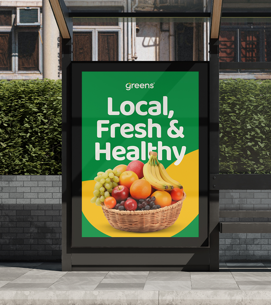
Our audit examined the brand across its physical and digital environment, including store façades, signage, wayfinding, promotional communication, price tags, packaging and online applications. The intention was not to change Greens for the sake of change, but to identify where greater clarity and consistency could make an established brand work harder.
We then rebuilt the full identity as one connected system.
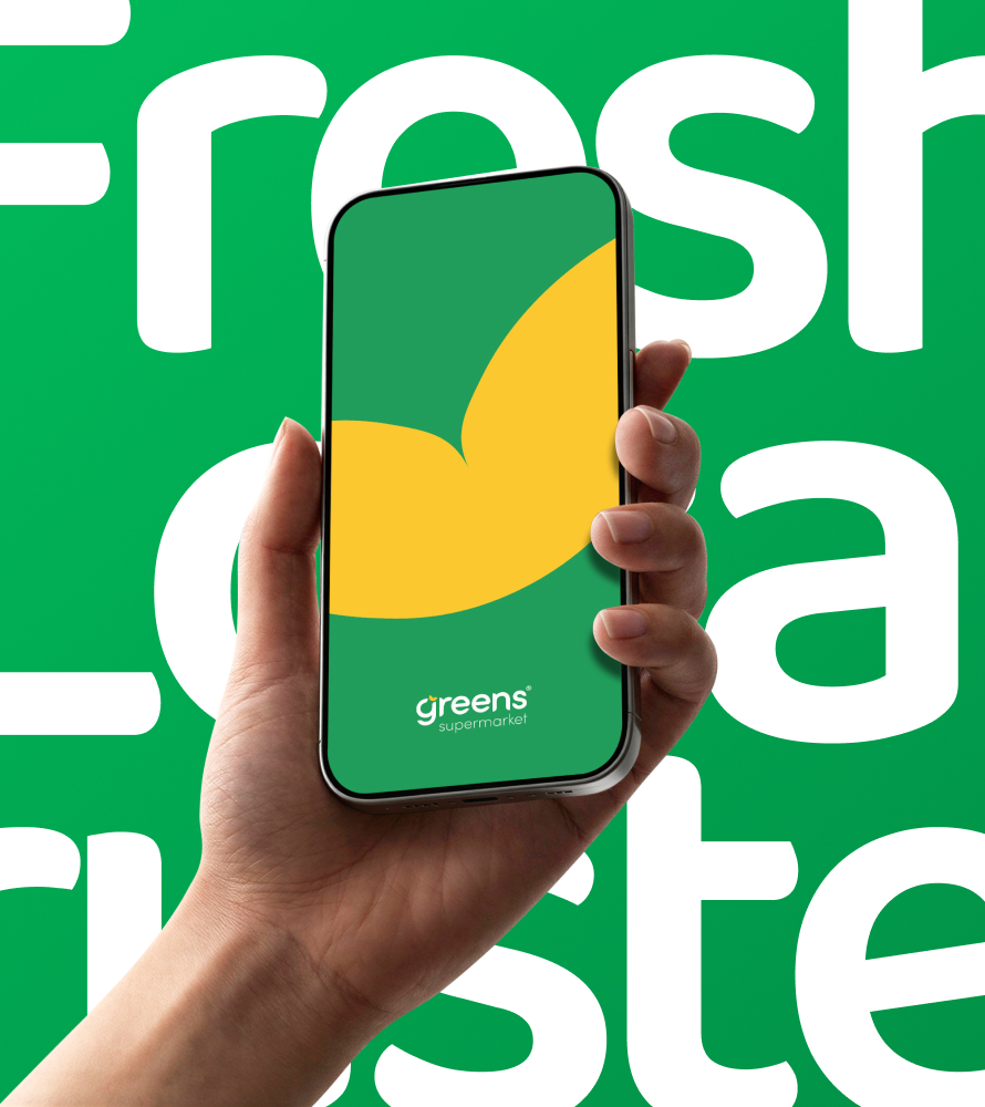
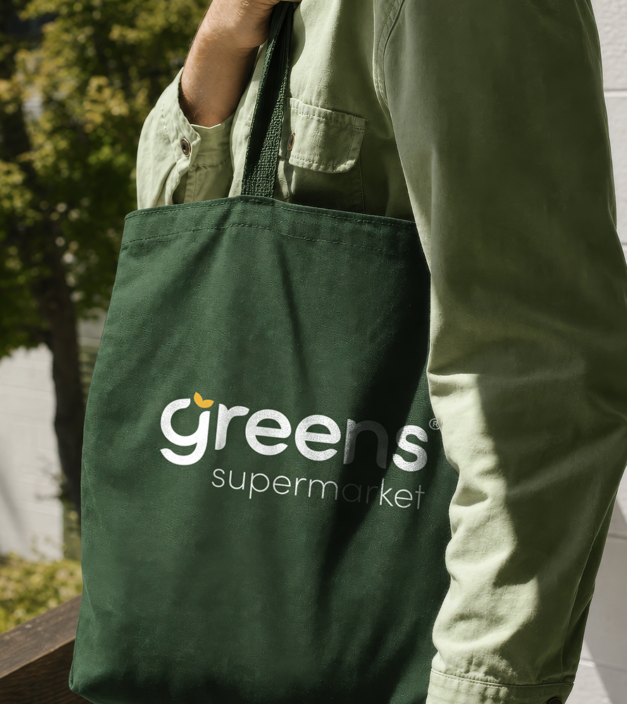
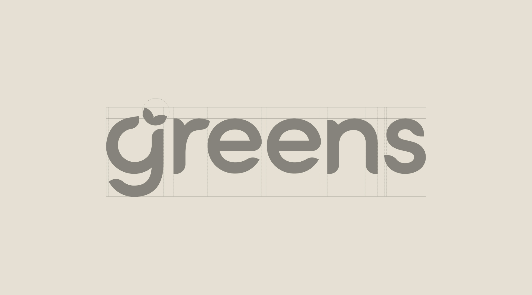
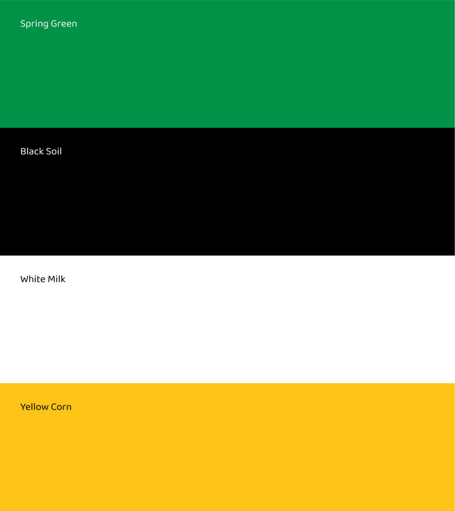
The familiar green remained central, preserving recognition and continuity, while the refreshed wordmark introduced a softer, more contemporary character. The yellow leaf became a distinctive brand asset, supported by a produce-inspired colour palette, rounded typography and a flexible iconography system.
Every decision was shaped by the same principle: Greens needed to feel recognisably itself, but better equipped for where the business was going.
THE IMPACT
The project transformed a single-format branding opportunity into a wider strategic shift for Greens.
With the delivery of the commercial naming, identity and launch framework for Little Greens, creating the first new format, Steves&Co built a clearly pre-defined full brand family, redeveloping the motherbrand and sub-brand architecture required to support Greens Supermarket, the forthcoming formats offer and other formats the business may introduce over time.
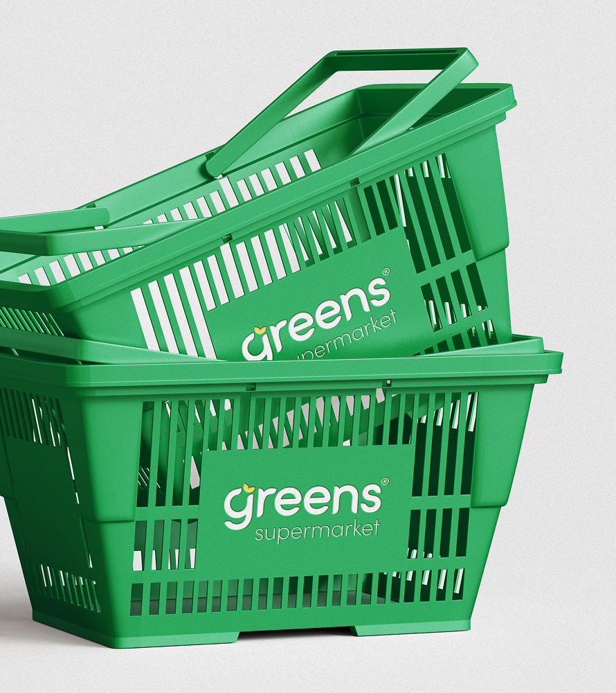
The refreshed identity system brought greater consistency across the brand’s key touchpoints, from logos, promotional materials, new colour usage and price communication to packaging, signage, digital platforms and store environments. Individual formats can now speak to different shopping occasions and audiences without becoming disconnected from the Greens name.
Beyond the visual identity, the work gave Greens a clearer way to organise and communicate its growing portfolio. It re-energised an established brand while protecting the trust, familiarity and value it had built over time.
What began with the launch of a smaller convenience format became the foundation for a more coherent, scalable and future-facing retail brand.
PROJECT SERVICES
Brand Strategy, Market Research, Brand Audits, Brand Positioning, Brand Architecture, Naming, Logo Design, Visual Identity, Brand Guidelines, Tone of Voice, Design Systems