The brief.
Our approach.
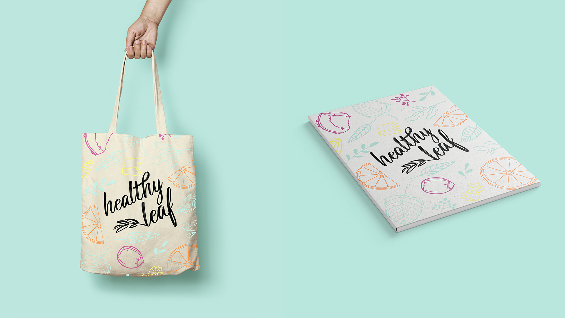
Taking inspiration from the natural biosphere, as well as the ingredients in the products themselves, our team created a fresh, vibrant, attention-grabbing package design that reflected the core values of the brand – honesty and wholesome eating.
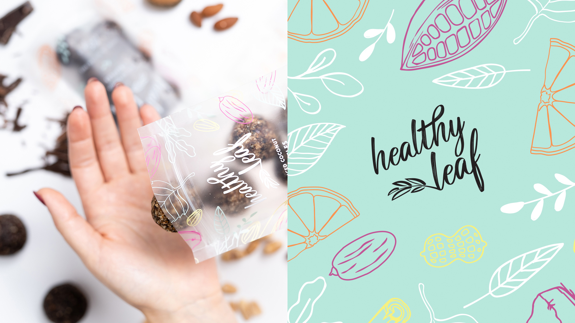
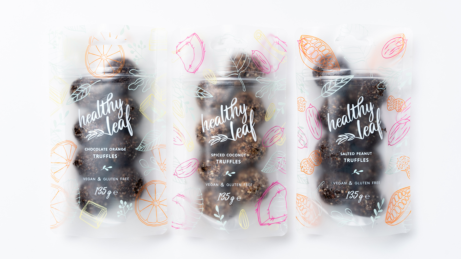
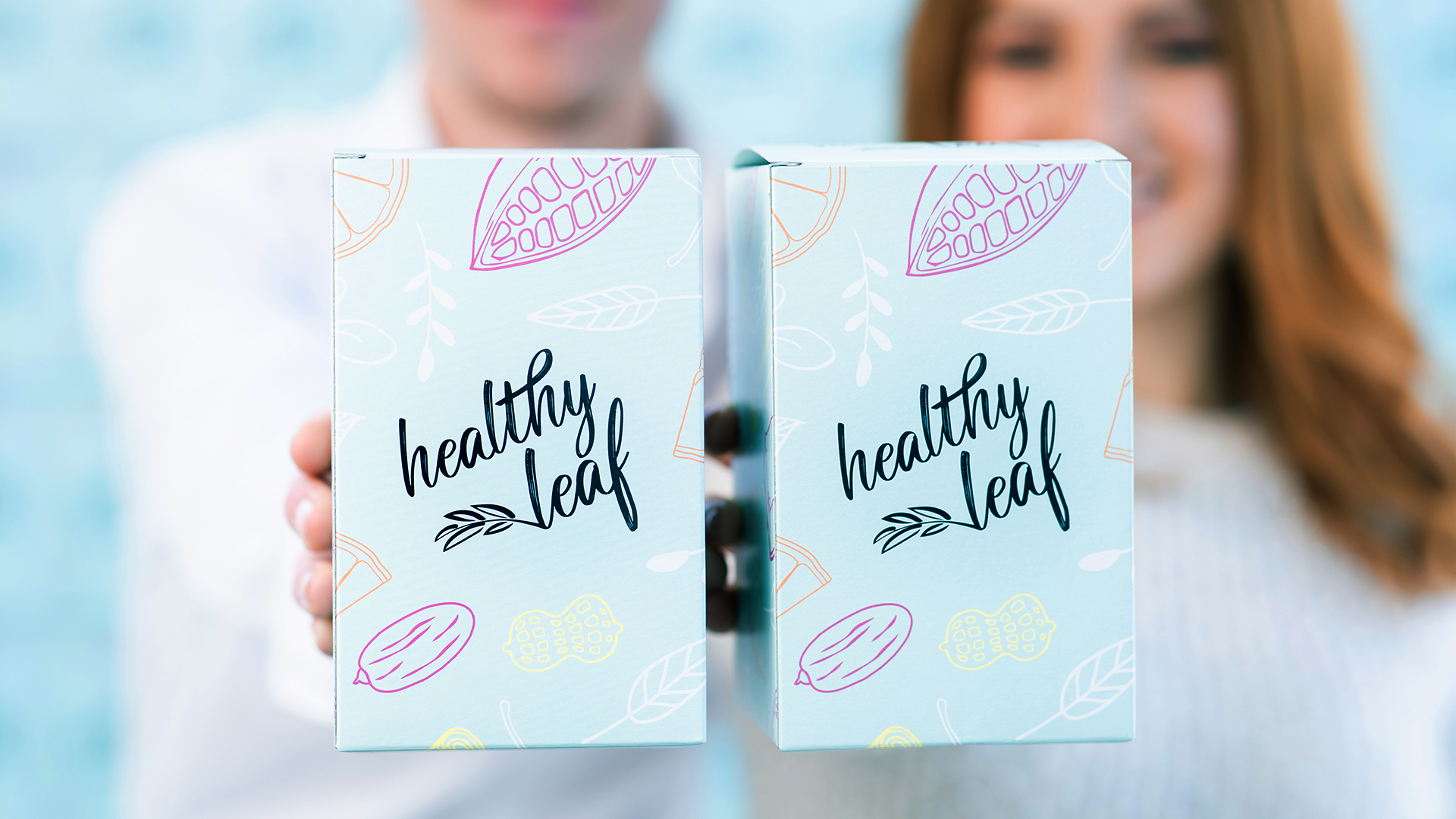
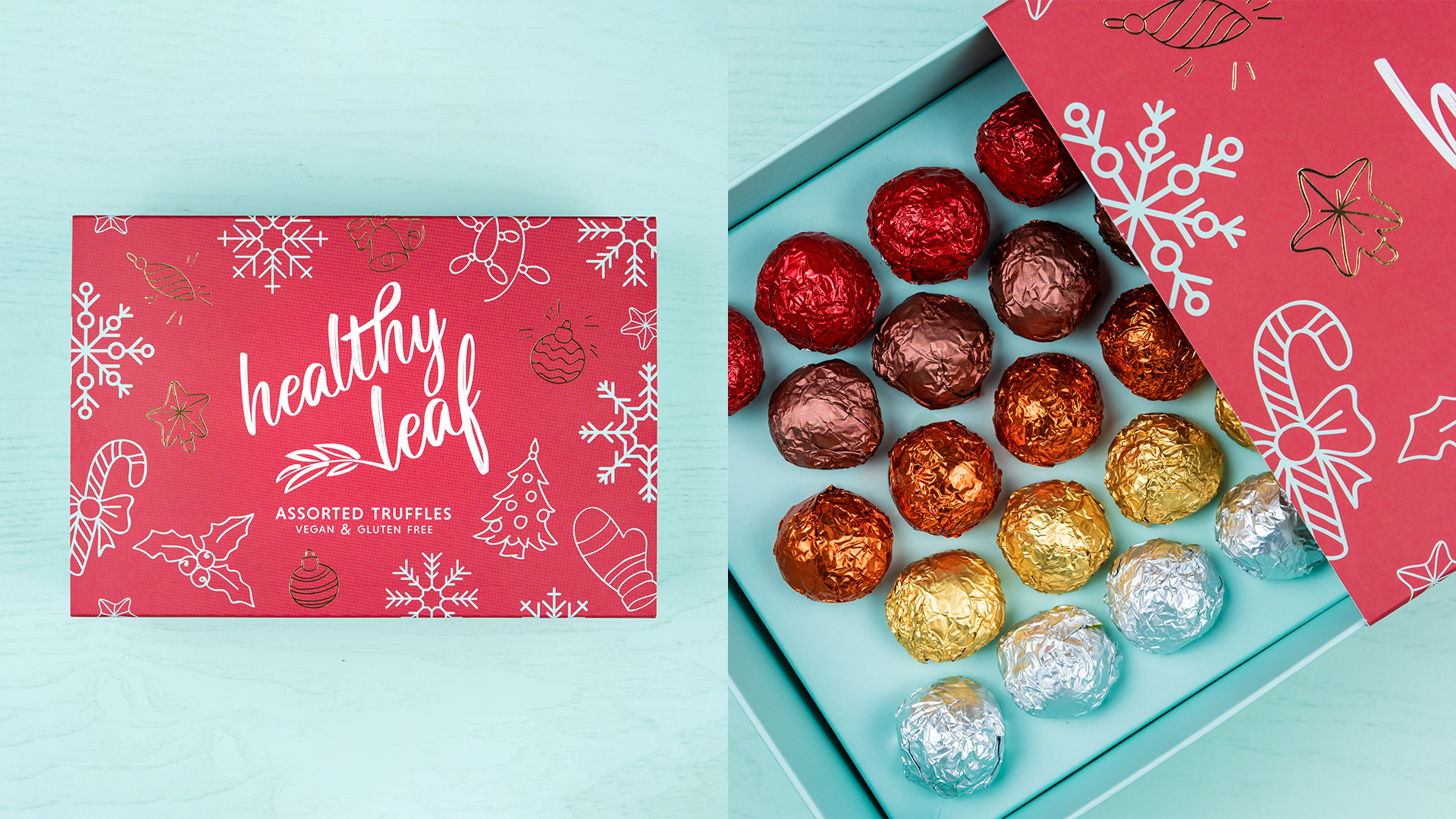
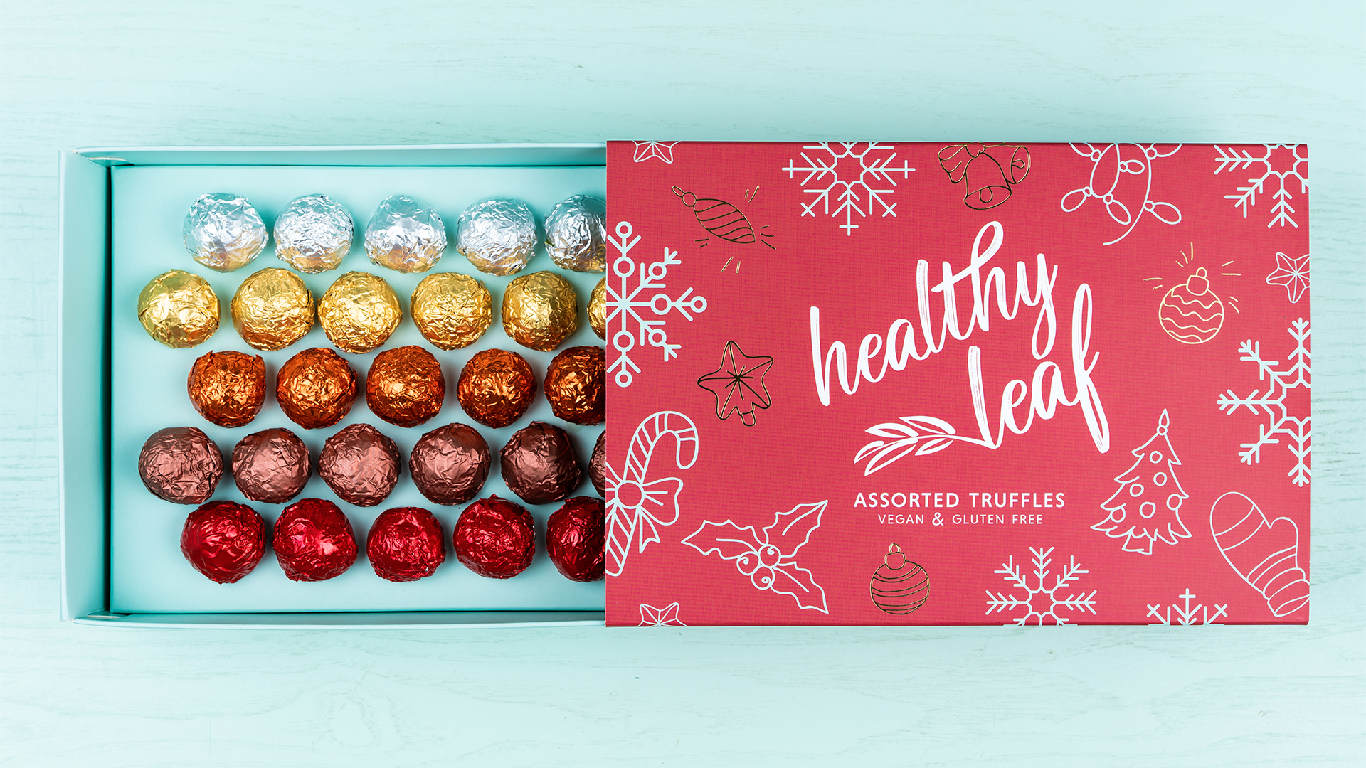
Individual truffle wrappings, boxes, and limited edition seasonal packaging were designed to be simple yet striking with a bright and uplifting colour palette. In order to stay true to the brand’s moral responsibility to remain eco-conscious, individual truffle packaging was created using a transparent recyclable plastic. Product information was printed in lively white typeface for clean contrast and coloured illustrations were carefully distributed around the box.
White and mint were primarily utilised across the re-brand to reflect purity and freshness, complimented by soft natural hues to communicate warmth, however seasonal Christmas boxes made use of pinkish hues and foil elements to convey festivity while remaining subtle and on-brand. Year-round gift boxes were designed with an orange sleeve with spot UV elements for dimension and a premium, luxury feel.
Impact.
The successful re-brand solidified Healthy Leaf’s position as a serious contender in the health food market and caused the brand to gain sudden attention in local news and media.
Healthy Leaf now services a huge consumer base from supermarkets and health shops across the Maltese islands, as well as a popular online shop. With an ever-growing product line and collaborations with larger food and beverage chains, the company continues to grow to new heights and shows no signs of slowing down.