The brief.
Our approach.
Through their very name, Melita is intrinsically tied to Malta, the local identity and heritage. This powerful emotional connection to the brand in the market, through communication stress tests and brand perception studies, proved to be one of Melita’s greatest strengths.
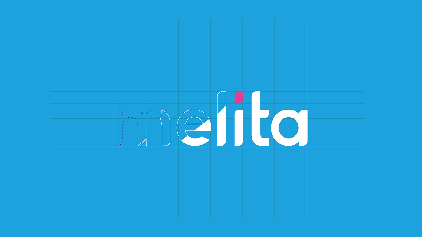
With this in mind, we drew inspiration from Malta for the new branding, starting with the bold, light-blue brand colour, symbolising the surrounding sky and sea, contrasted with a bright pink, symbolising innovation and standout, true to the nation’s bold character. The rebrand was implemented across all levels of the brand architecture.
To further build Melita’s connected identity across these sub-brands, we created the ‘messaging’ mechanism, as the brand shape designed within the dot on the i in Melita for visual structure and consistency in communications. We also developed a company positioning statement and comprehensive brand book, with communication goals and guidelines for different channels and platforms, and a three-year marketing strategy.
Impact.
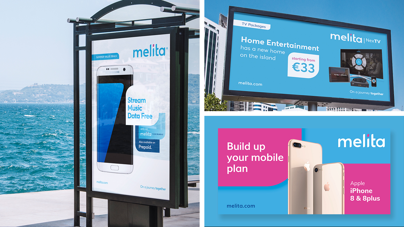
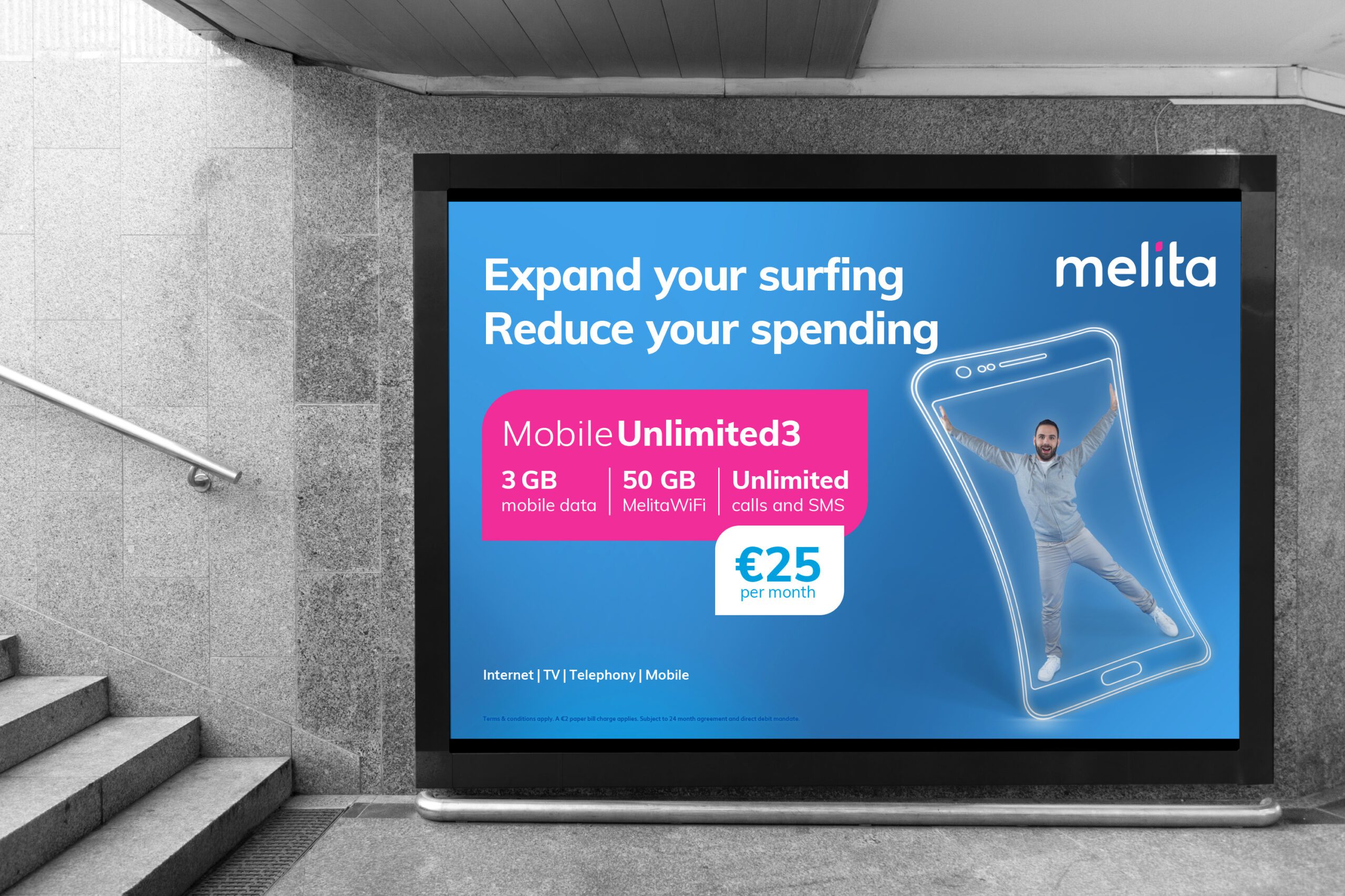
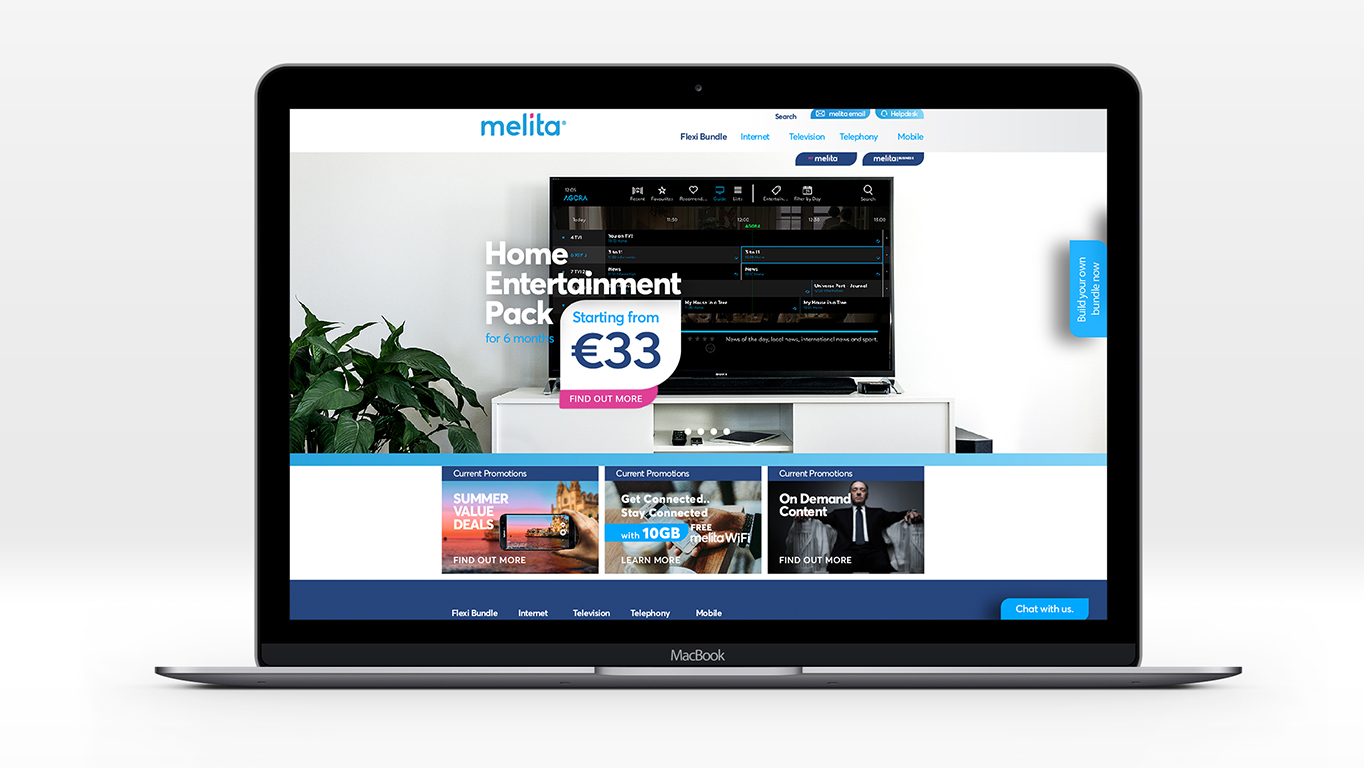
The new brand was launched in 2017, alongside the launch of a new product, NexTV. All major touch-points, online and offline, were redesigned in line with the new brand.
The rebrand also resulted in continuously improving customer and market perception, and Melita has continued to grow, now operating across borders with melita.io.
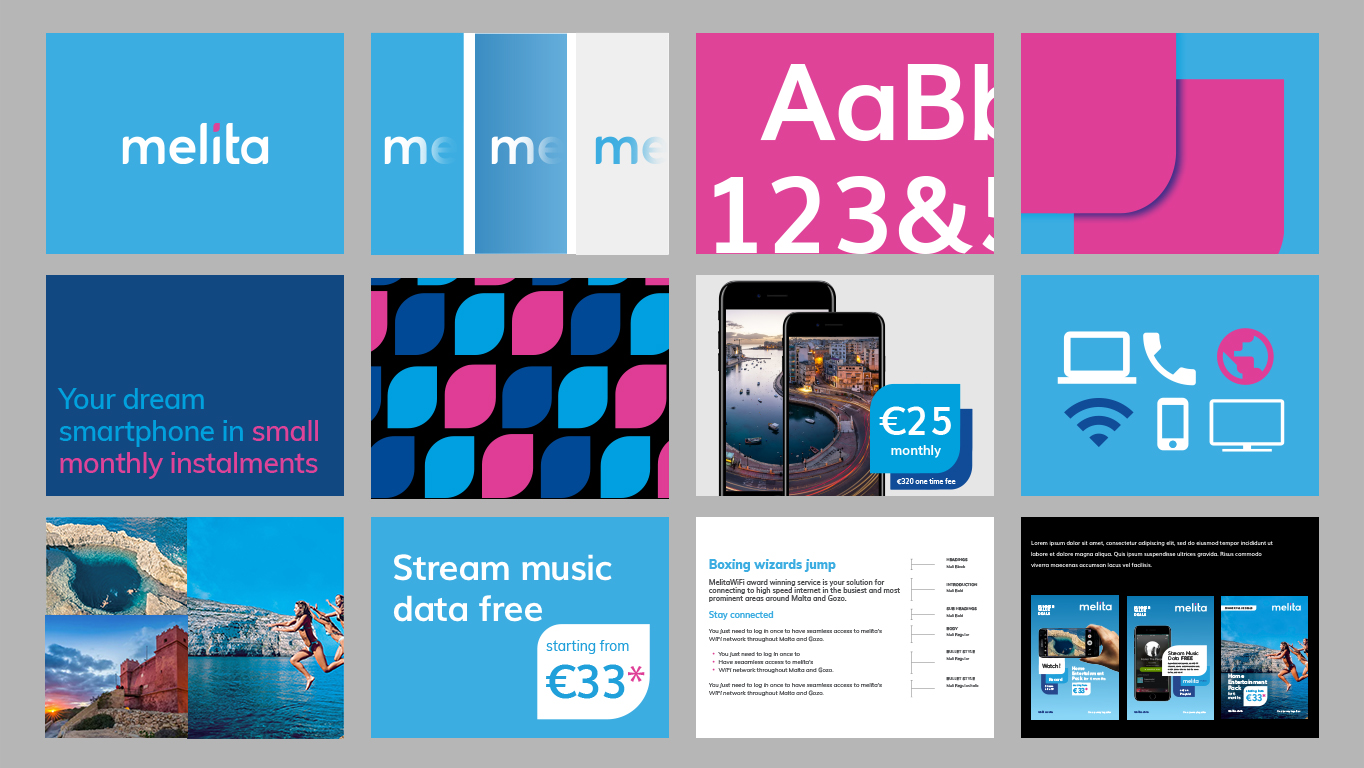
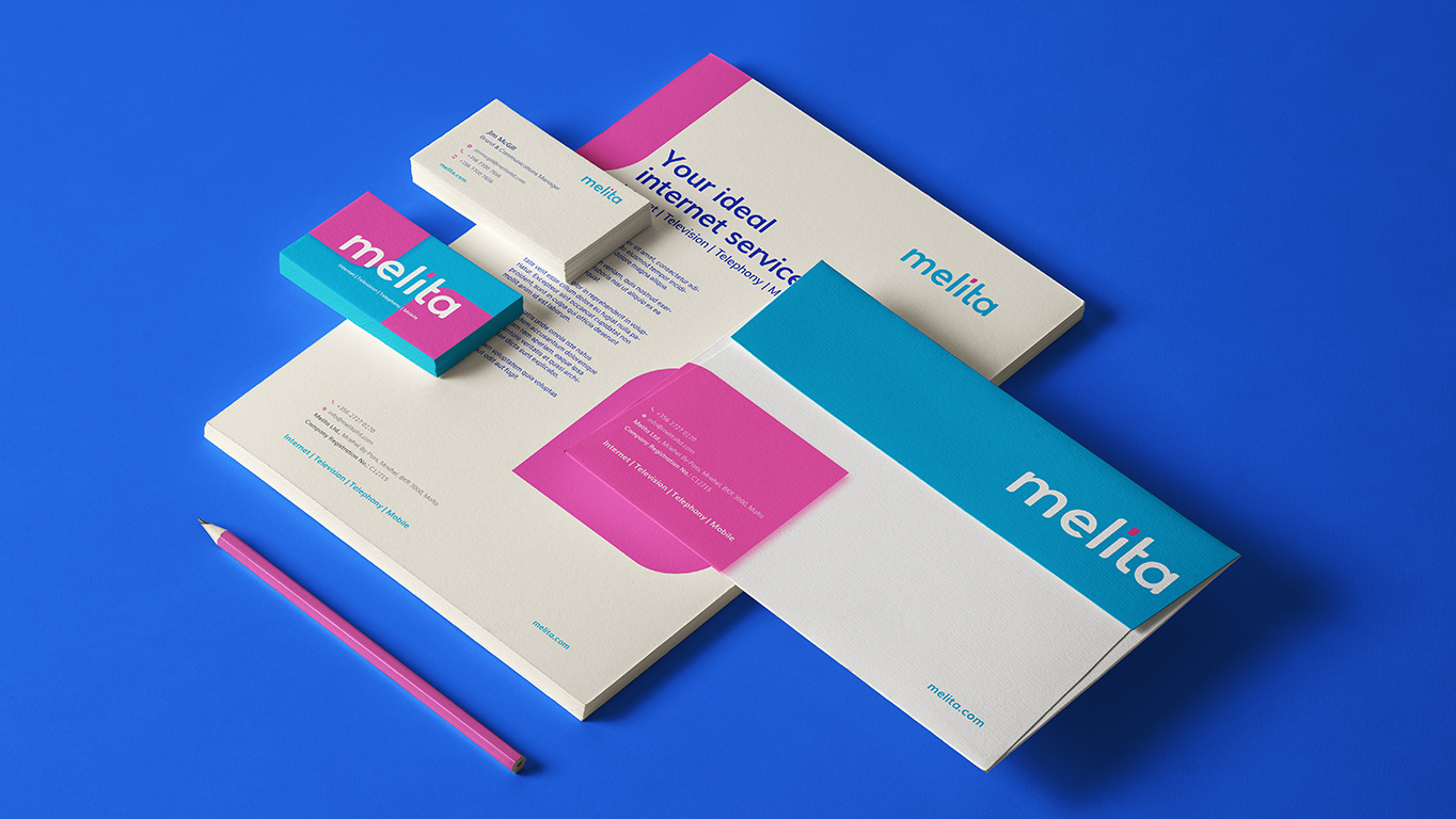
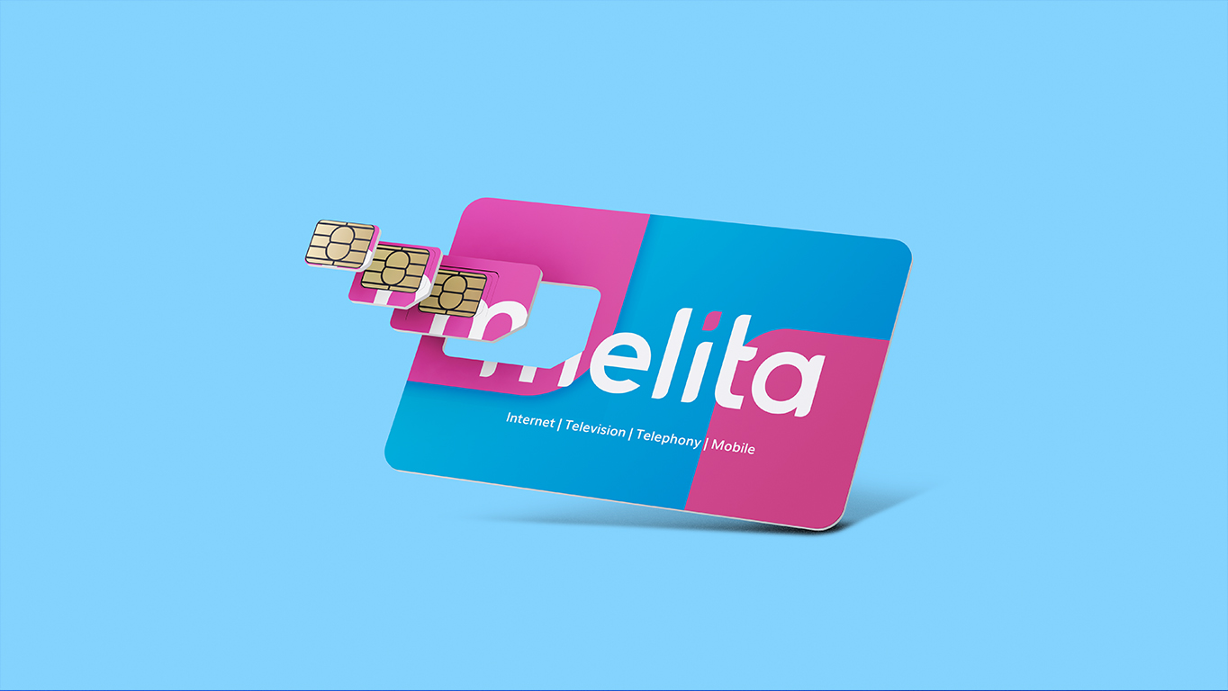
The below works reflect both final and design prototypes developed for the brand.
“Steves&Co worked to a tight project timeline to create a brand identity in line with the updated Melita brand vision, and extending the new look and feel across assets for internal and external use. We were very pleased with the results.”