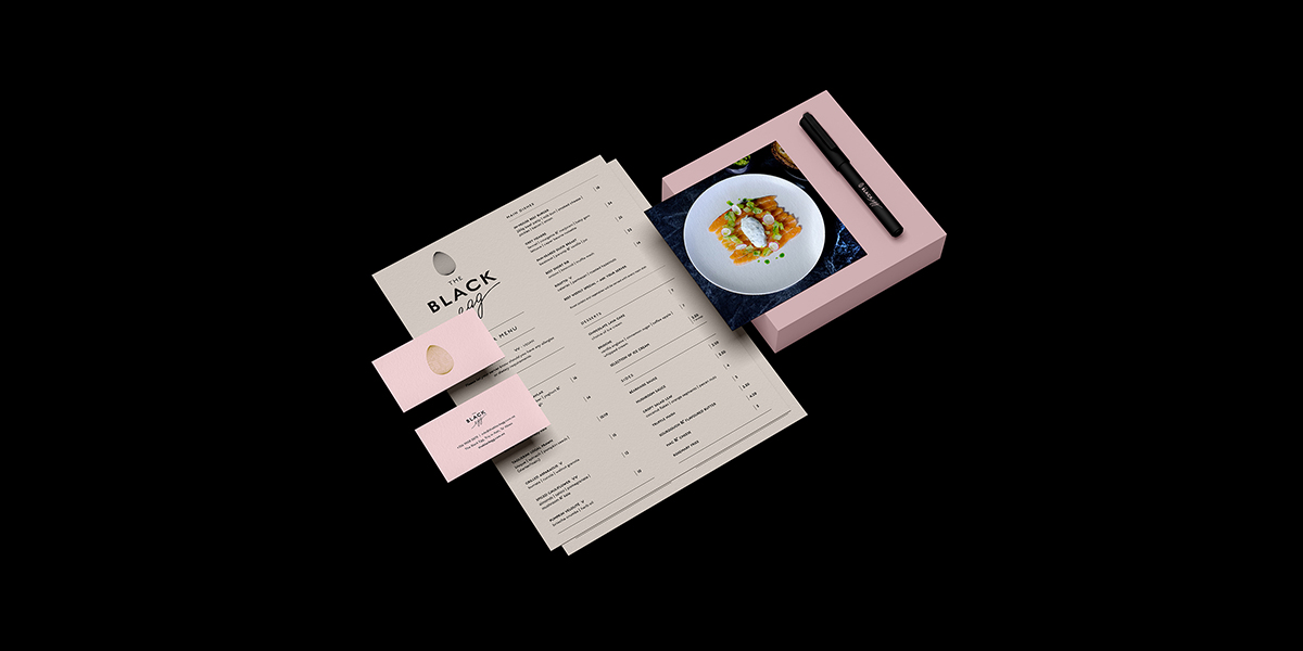
The Black Egg, bruncheria restaurant brand creation.
ClientThe Black Egg
CountryMalta
Year2020 -
The brief.
Our approach.
Once we established the details of the vision via our initial workshops, we then carried out a research deep-dive within both foreign and local sectors to ascertain the condition of the current market and establish The Black Egg’s audience, positioning, and potential entry point. From here, we identified several opportunities in communication and service where we could leverage commonly-overlooked details to express a distinctive brand personality, as well as communicate a wider passion for extraordinary upmarket food and cocktails.
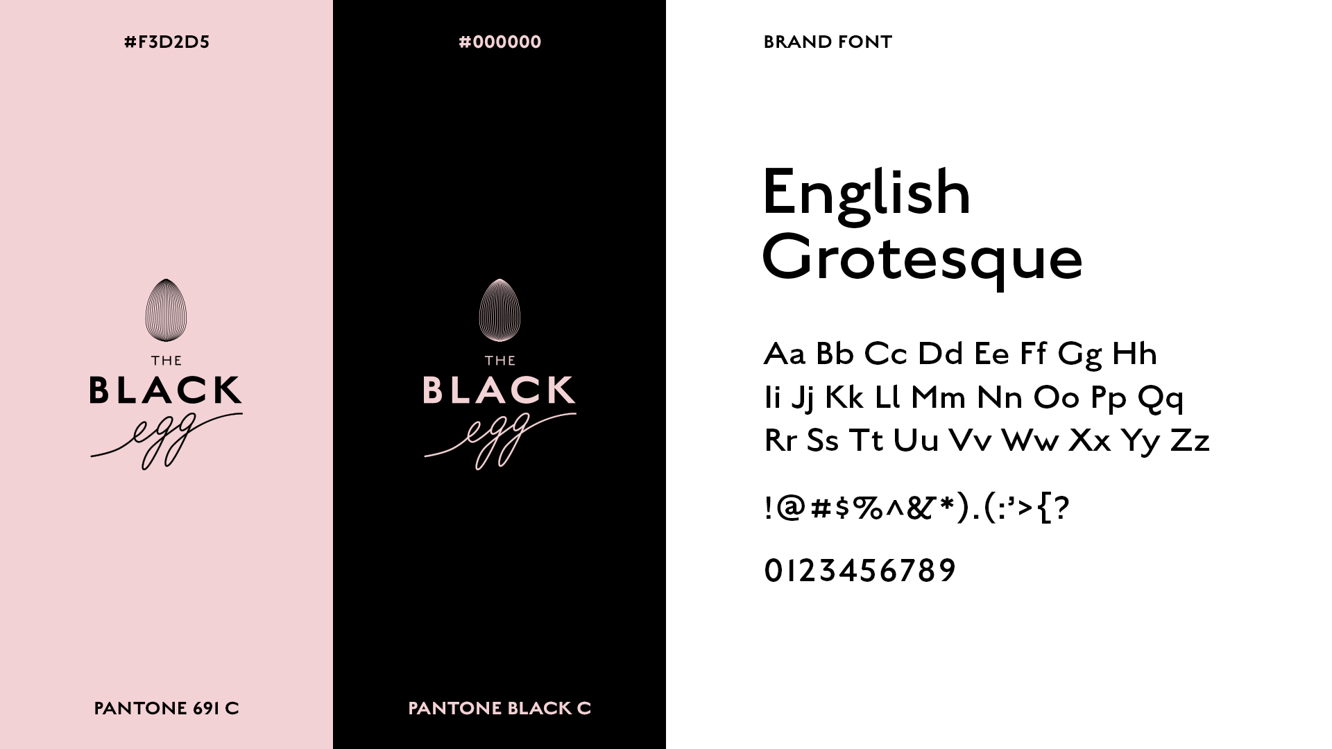
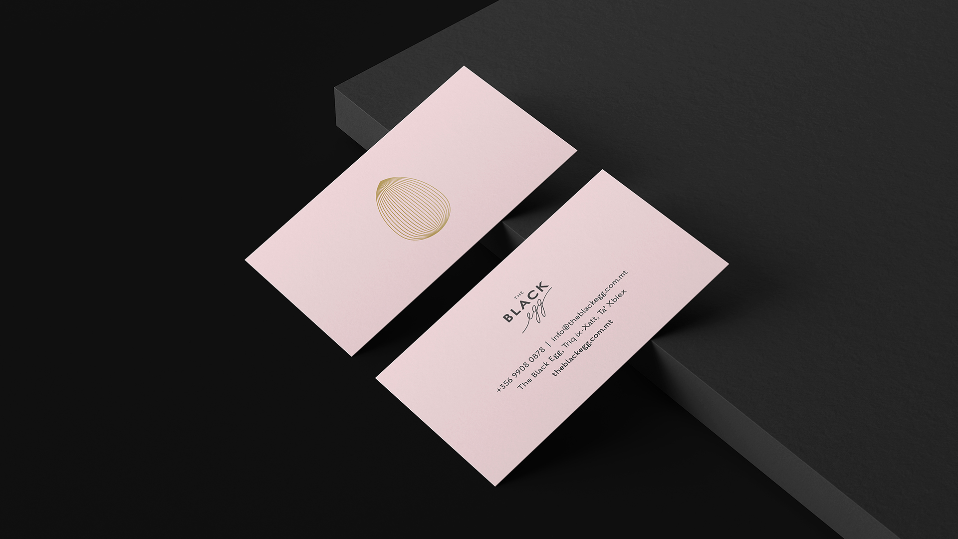
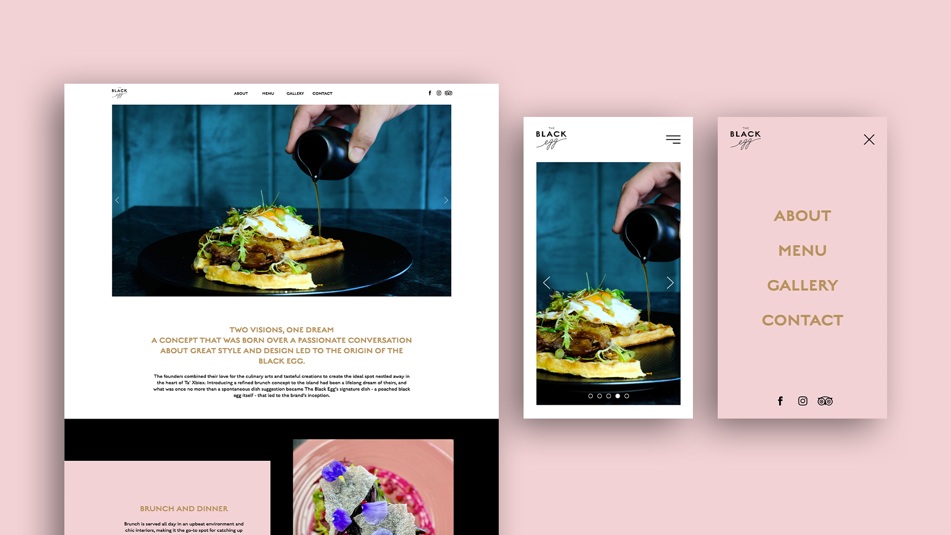
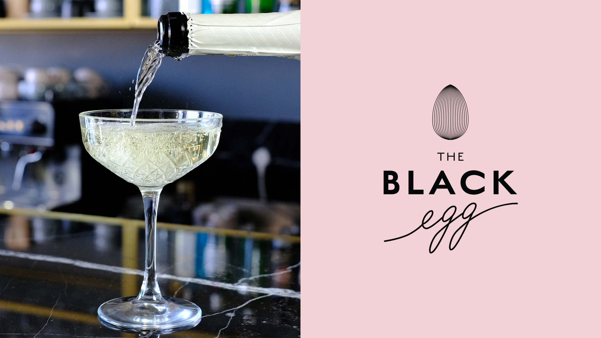
Next, we conceptualised the logo: inspired by the nominal signature dish and linear optical illusions designed to play with the visual perception of the viewer, fine delicate black lines meld together in the curvature of an egg shape to convey movement, sophistication, and indulgence. A pop of calming dusty pink adds depth and softly brightens the overall brand palette, without contrasting too harshly against the darkness of the background – to retain an air of refinement. The website was then designed and built to be clean, modern, and easy to navigate – both as a platform to share information about the business, and also to showcase the brand’s strong sense of aesthetics.
Impact.
Upon launch, The Black Egg was met with instant accolade and an influx of enthusiastic positive reviews. Revenue far exceeded forecast figures, and tables became highly sought-after once organic word-of-mouth buzz was generated. Today, the bruncheria regularly tops must-visit lists in travel recommendation publications due to its continued innovation, allowing it to remain a fresh, original standout in the local market and beyond.
